Open Web Camp II at Stanford today was a blast! Lots of information. Plenty I’m already familiar with, but also lots I learned.
I woke up late, only to see people tweeting about the conference (doh!), so I missed seeing Molly Holzschlag. But I arrived just in time to see…
Estelle Weyl: “CSS3 Implementable Features”
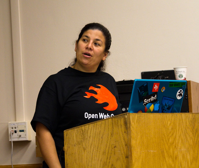
Estelle’s talk was about what features of CSS3 are available to use right now. She covered all the usual: border radius, text shadow, box shadow, tilted images, etc. And she showed off Paul Irish’s css3please.com, which greatly helps implement these cross-browser, with even the filter hacks required to pull it off in IE! (no word about the performance hit of these IE hacks, which I’m sure I’ve read about somewhere…)
One of the cool new things I learned was that you can use CSS shorthands to declare border-radius (rounded corner) values. So instead of this mess (courtesy of border-radius.com):
| |
All you need to do is this, which is equivalent to the above (disclaimer: I’m not sure about the compatibility of this shorthand!):
| |
Or if you get bored of doing a perfectly rounded border radius, you can also do elliptical border radius (again, I’m unsure about the compatibility!):
| |
Matt Henry: “Going Mobile”
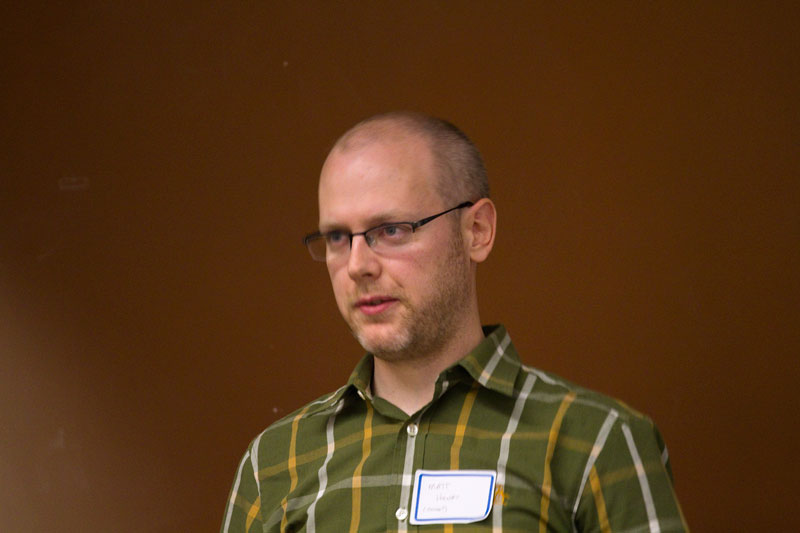
I’ve worked closely with Matt at Yahoo! Mobile for the past year, so not much was new for me. It seemed that the audience really dug the talk though (lots of questions were asked!).
Essentially, Matt explained that you have to make at least two different versions of your website: one for feature phones and one for smartphones like the iPhone, and with the help of something like WURFL, detect the phone and direct the user to the appropriate site.
Matt also emphasized that feature phone browsers are terrible, much worse than IE6.
As part of a response to someone’s question, Matt talked about the idea of feature detection on smart phones, essentially saying that by the time you’ve sent the JavaScript feature detection to the device, it’s already too late, and in some cases might end up crashing the browser (for feature phones that have an extremely small page weight such as 9KB). So for now it looks like user agent sniffing on the server-side is the way to go.
And there was a brief shoutout for Yahoo! Blueprint, which renders a website across thousands of phones.
Victor Tsaran and Todd Kloots: “Accessibility 101″
Before joining Twitter, Todd Kloots spent some time with Victor Tsaran at Yahoo! on accessibility.
In this talk they went over common misunderstandings and showed that even today, big companies such as Digg.com are still not investing in making their site accessible.
This was a pretty high level overview of basic accessibility, including an introduction to screen readers and ARIA attributes.
Here’s some of the stuff covered:
-making forms accessible with fieldset and legend elements and linking captions to their inputs.
-adding alt tags to images even if blank (so the screen reader doesn’t announce the entire URL)
-the title tag doesn’t make things more accessible, whereas the alt tag does
-screen readers obey display: none and visibility: hidden and that to hide something from normal users you have to position it offscreen (with negative left or text-indent).
-how to make basic tables accessible by taking advantage of table summary and caption, as well as putting tables headings into the <thead> element.
I’m still trying to absorb it, but Todd also mentioned that a simple anchor tag for a button didn’t semantically make sense, and that it was more semantic to have a span wrapped around a <button>. I guess I either don’t understand fully or I just disagree, since a <button> appears within a form and sometimes it just may be a cleaner solution to use a simple anchor tag. I guess I will need to look into this more.
Joseph R. Lewis: “Refactoring for Mobile”
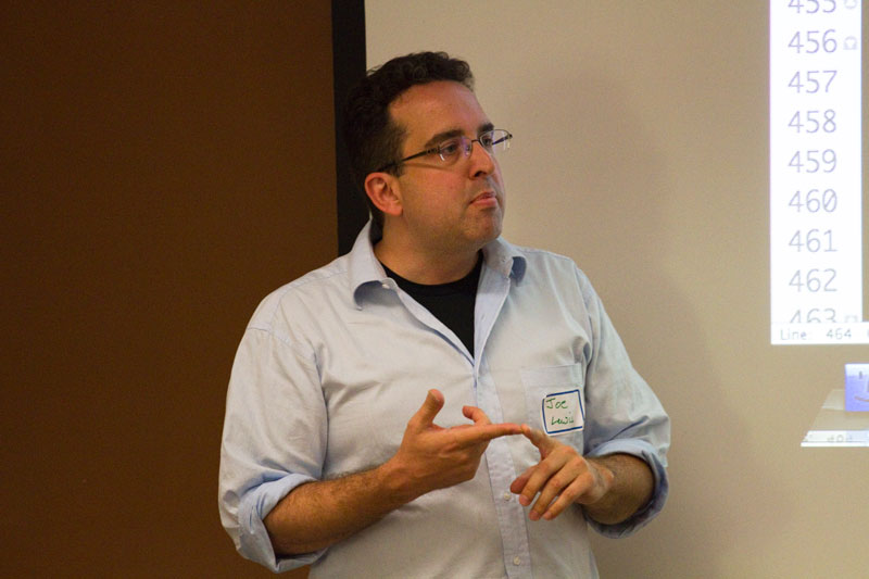
This talk was basically a live demo of implementing CSS media queries in a WordPress installation to make an iPhone-friendly version of the site. There was a good use of the viewport tag, media queries, @font-face, text-shadow, box-shadow, border-radius, etc.
One surprising thing I learned was that apparently Mobile Safari recognizes border-radius without the webkit prefix? I’m going to follow up on this.
Dirk Ginader: “5 layers of web accessibility”
Dirk is another Yahoo! (we’re everywhere!) whose presentation was also about accessibility.
As web developers, we’re already familiar with three layers of the web:
- HTML, responsible for content
- CSS, responsible for presentation
- JavaScript, responsible for interaction
Dirk introduced another two levels:
- CSS for JavaScript: special styling for when the full-featured JavaScript is available (this can be used by having JS add a “js” class to the document, and therefore writing CSS rules with “.js” in the front)
- WAI-ARIA: special HTML attributes to help define roles, landmarks, allow the developer to give instructions directly through the screen reader, etc.
Also a few more points:
- use the JavaScript focus() method for events (alerts that are injected at the top of the document and are otherwise ignored by the screen reader, windows that open and close, etc.)
- :hover CSS pseudoclass is for the mouse only.. be sure to also use the :focus pseudoclass! (my note: this is also important on mobile, for touch devices!)
Summary
Overall a great day. The food was pricey but good, and the whole event was free, so I can’t complain! Nice event, I just wish I could’ve seen the other talks in the other tracks!
Comments