⚠️ Warning: this is an old article and may include information that’s out of date. ⚠️
The other day I glanced at a classmate using Baidu to perform an image search and was impressed with their presentation:
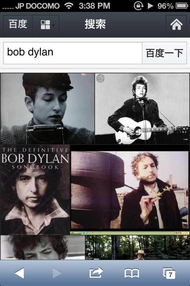
Note the nice big images and the lack of margins around images. After seeing this presentation, I realized that the common approach of adding margins around images is pretty unnecessary.
I also noticed that the images are a variety of sizes, leading to a less sterile experience. There’s surely some clever math going on behind the scenes here to make sure the images appear “justified” (to use a word from the recent Flickr redesign).
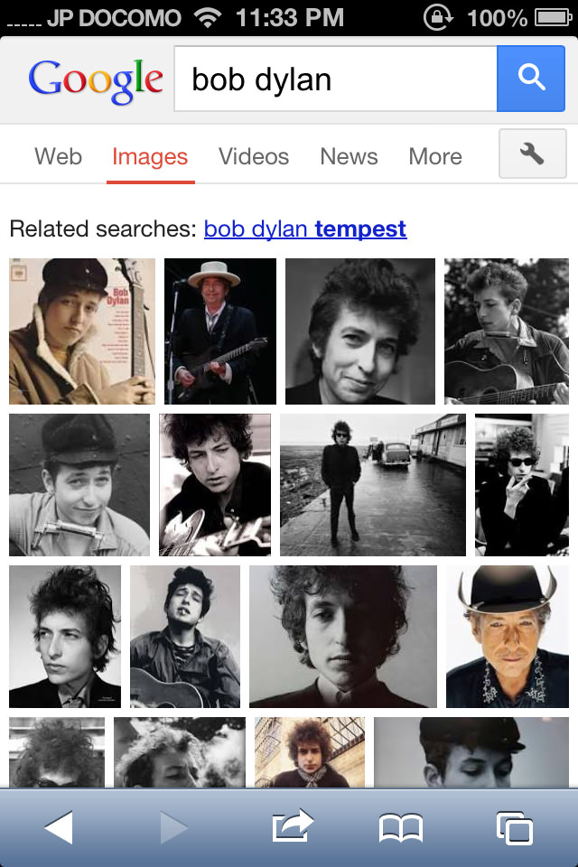
Note the smaller photos, which sometimes causes features on images to be indiscernable.
Also note the more common approach of adding margins around the images. This seems to remove a lot of space which could otherwise be used to show more details of images, which is the approach Baidu takes.
Bing
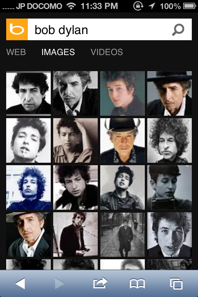
Bing uses a nicely-designed slick interface with a black background, which I tend to like a bit better.
However, all its images are cropped or resized to be exactly the same size, leading to a more sterile gridlike experience.
Also, just a minor complaint, but the search magnifying glass appears to be a tiny bit blurry, especially compared to the sharpness of the Bing logo. But it’s barely noticeable, especially compared to Yahoo (below).
Yahoo!
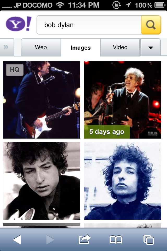
Yahoo has nice big images, actually a bit too big. Bit it also appears to suffer from the approach Bing uses to resize photos to make their dimensions exactly the same.
Again note the common white margins around the images.
The non-retina top graphics (logo and search button) are so blurry and distracting that I have to at least mention them here. These images look blurry on every modern phone on the market today, and it’s sad to me that neither developers nor QA cared enough about this to do something about it.
Strangely, these images look fine on the main “Web” tab, but they are distractingly blurry on this Images view as well as others.
Flickr mobile app (iOS)

The Flickr app itself has some decently-sized images, but here again we see the image margins at work. This is also present on the “justified view” on the desktop site, so I suppose they wanted to be consistent.
Flickr mobile web
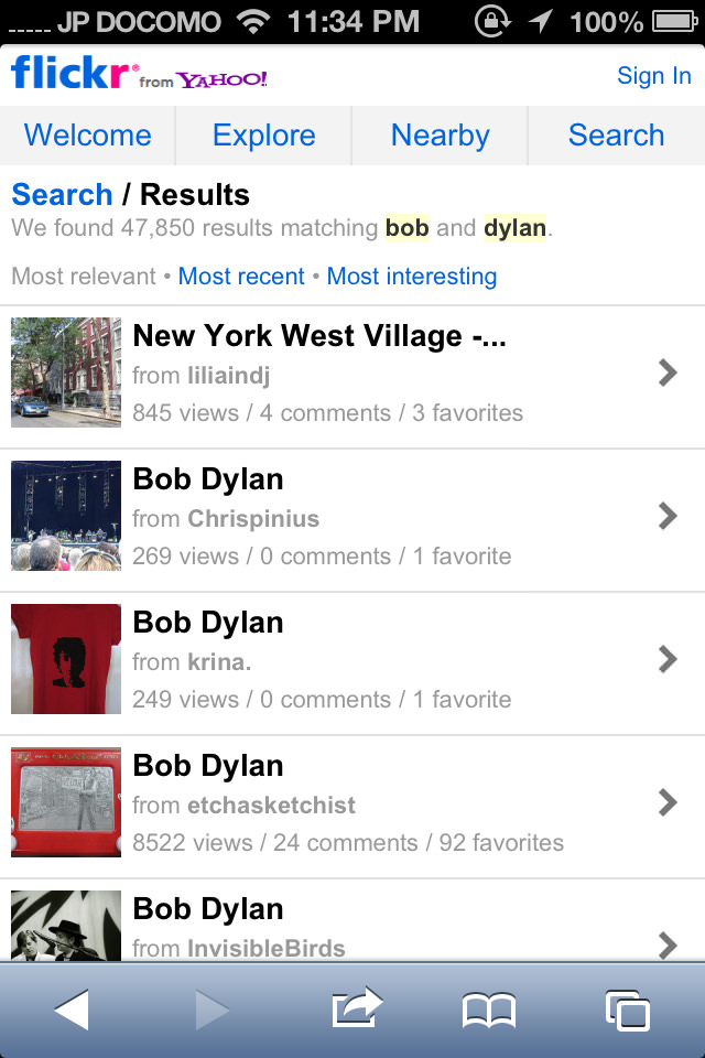
This is certainly the worst out of the bunch. It’s a real waste of space, with small images sacrificed for textual information that’s a little excessive for this screen.
I think this is just due to the website’s age. Flickr’s mobile website is much neglected and is showing its age. I would be really nice to see updates to match the nice progress they’ve made with the “justified layout” that you can see on their desktop site and mobile app.
Comments